Phynixtechserve.com is a technology strategy and consulting website built to help businesses and home users find reliable IT support services, security solutions, and consultation-driven guidance.
The website needed to communicate a wide range of technical services without confusing visitors. The biggest challenge was building a trust-first structure that feels professional, clear, and action-driven for both business clients and home users.
Trust and clarity were critical. Visitors must understand services quickly and feel confident before contacting.
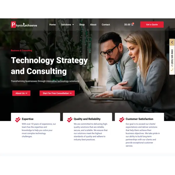
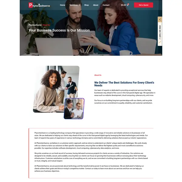
We redesigned the structure and layout to guide users smoothly from trust → understanding → action. The new layout highlights service categories, adds credibility blocks, and supports repeated CTAs for higher conversions.
We followed a step-by-step workflow to keep everything aligned with the client’s vision and business goals.
Website Audit
Reviewed existing structure and identified clarity + trust gaps in the layout.
Service & Navigation Planning
Grouped services into business and home-user sections for easier discovery.
UI Redesign
Improved spacing, typography, and section hierarchy for a professional look.
Trust & CTA Optimization
Added credibility-focused sections and optimized CTA placements.
Mobile Testing
Ensured clean experience across devices with responsive section behavior.
Launch & Final Review
Final checks for UX, CTA flow, and content accuracy before go-live.
The redesigned consulting layout delivered clear service communication, improved trust-building, and a conversion-ready structure.
Clear Service Structure
Services grouped into business and home-user sections, reducing confusion and boosting clarity.
Stronger Trust Signals
Credibility sections and professional layout helped visitors feel confident faster.
Conversion-Ready CTAs
Consultation and contact CTAs were placed in key sections to improve lead actions.
Scalable Website Setup
The structure supports adding more solution pages while keeping navigation clean.
The final website delivers a simple, professional consulting experience that supports both technical credibility and visitor confidence.
This case study shows how a clean service structure, strong trust messaging, and a
conversion-first layout can help an IT consulting startup communicate value and generate leads.
For consulting websites, clarity + credibility + action matter more than flashy design.
Looking to Re-design Your Website?
If you want a modern, trust-building website that clearly explains your services and helps you generate more leads - let’s build something clean, fast, and conversion-focused.